
Introduction: The Silent Power of Color
Color is one of the most underestimated yet influential elements in interior design. Beyond aesthetics, color shapes emotions, stimulates senses, and orchestrates behavior within spaces. At home—where living, working, and unwinding coexist—the impact of color becomes profound. A well-chosen palette can motivate productivity during the day and evoke serenity by night, balancing form and function with psychological depth.
The Psychology of Color in Everyday Spaces
The human brain processes color faster than words or shapes. Each shade triggers subconscious associations, many rooted in nature and culture. Designers and psychologists have long studied how colors influence decision-making, productivity, and emotional well-being. A pale blue wall may calm anxious thoughts, while a bold red accent can energize a dull space. Understanding this science ensures homes are not just beautiful but also emotionally intelligent environments.
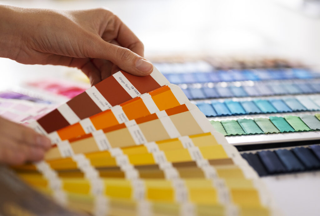
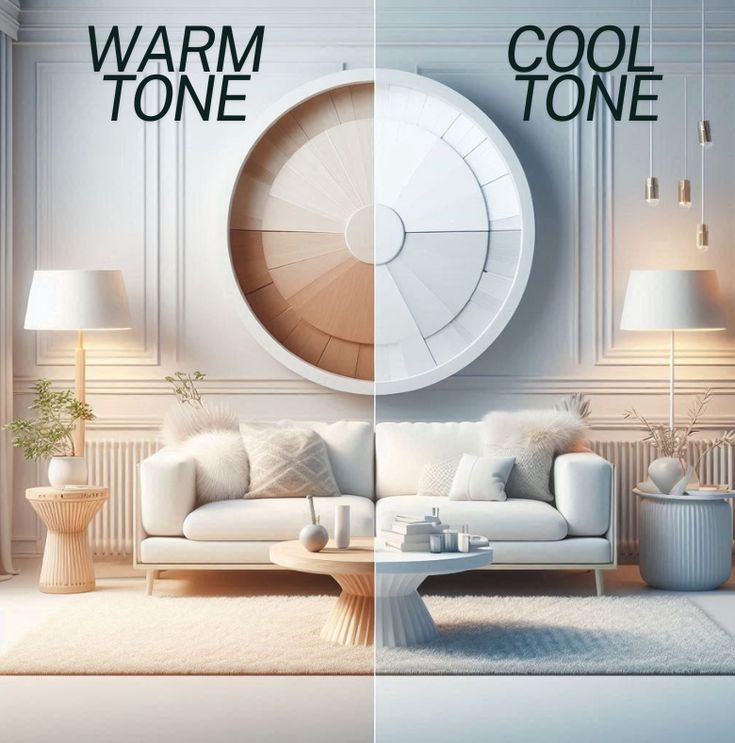
Warm vs. Cool Colors: A Foundational Divide
Colors fall into two broad families: warm and cool.
- Warm Colors: Reds, oranges, and yellows radiate energy, passion, and sociability. They make rooms feel intimate and inviting but can become overwhelming if overused.
- Cool Colors: Blues, greens, and purples suggest calmness, clarity, and spaciousness. They are often chosen for spaces requiring focus and relaxation.
Balancing the two families helps create dynamic interiors. For instance, a living room may pair a cool blue sofa with warm terracotta cushions, achieving harmony between stimulation and comfort.
Red: Stimulating Energy and Urgency
Red quickens the pulse and heightens awareness. Its intensity is powerful in spaces designed for activity, such as home gyms or dining rooms. However, prolonged exposure may cause agitation, making it less suitable for bedrooms. Instead of painting an entire wall red, designers often use it in accents—artwork, throw pillows, or a statement chair—to inject vitality without overpowering the space.
Orange: Fostering Enthusiasm and Social Interaction
Orange blends the passion of red with the optimism of yellow. It exudes warmth, friendliness, and creativity. In homes, orange works well in communal spaces like kitchens and family rooms, encouraging conversation and shared moments. Muted terracotta or burnt orange tones feel earthy and modern, avoiding the overstimulation that comes with neon shades.
Yellow: Inviting Optimism and Mental Clarity
Yellow symbolizes sunlight and mental alertness. It is ideal for workspaces, breakfast nooks, or playrooms where cheerfulness and clarity matter. Research shows yellow stimulates memory retention and mental agility, making it a strong candidate for home study areas. However, too much vivid yellow may cause irritability, so balancing it with neutral tones helps maintain harmony.
Green: Balancing Calmness and Renewal
Associated with growth and nature, green embodies balance, peace, and rejuvenation. It reduces eye strain, making it perfect for home offices where long hours are spent at screens. Sage, mint, and olive greens create calm backdrops, while emerald tones add sophistication. Layering green with natural textures—wood, rattan, or linen—enhances its grounding effect, bringing the outdoors inside.
Blue: Enhancing Focus and Serenity
Blue is the color of trust, stability, and focus. In a home office, soft blues encourage concentration without inducing stress. Bedrooms painted in pale blue shades promote better sleep and relaxation. Deep navy or cobalt creates dramatic, structured interiors while maintaining serenity. Pairing blue with white or natural wood softens its sometimes cold perception, making spaces more welcoming.
Purple: Inspiring Creativity and Luxury
Purple combines the calm of blue with the energy of red, producing a color long associated with royalty and imagination. In creative corners, such as studios or reading nooks, purple fosters originality. Lighter lavenders soothe and calm, while darker plums and violets evoke richness and mystery. When paired with metallic accents like gold or brass, purple interiors feel undeniably luxurious.
Pink: Softening Moods and Encouraging Compassion
Pink is often linked with tenderness and compassion. It reduces aggression and promotes feelings of care, making it suitable for bedrooms, nurseries, or meditation spaces. Contemporary design has moved beyond traditional bubblegum pink, favoring dusty rose, blush, and salmon hues for a more sophisticated approach. These tones create a chic, calming environment without feeling overly sentimental.
White: Expanding Perception of Space and Purity
White reflects light, expands space, and introduces purity into interiors. It is the backbone of minimalism, often used in Scandinavian or Japanese-inspired designs. In small apartments, white walls maximize brightness and openness. However, an entirely white space may feel sterile. Adding layers through textured fabrics, wood accents, or plants brings warmth and depth, preventing monotony.
Black: Anchoring Depth and Sophistication
Black commands authority and sophistication. It anchors interiors, offering visual depth and contrast. While painting entire rooms black can feel oppressive, using it strategically—in trims, furniture, or feature walls—creates drama and refinement. Paired with softer tones, black ensures balance, embodying elegance without overpowering.
Grey: Subtle Neutrality or Emotional Detachment
Grey is versatile, straddling the line between modern sophistication and emotional detachment. Light greys soothe, while darker charcoals add weight and drama. Grey works well as a backdrop, allowing other colors to shine through. To avoid dullness, layering grey with textures such as velvet, linen, or matte finishes adds interest and richness.
Earth Tones: Grounding Interiors with Nature’s Palette
Inspired by soil, stone, and wood, earth tones provide warmth, grounding, and familiarity. Browns, tans, ochres, and rust shades connect people with nature, creating environments of comfort and stability. They work particularly well in living rooms and bedrooms where relaxation is paramount. Earth tones also harmonize beautifully with plants and organic materials.
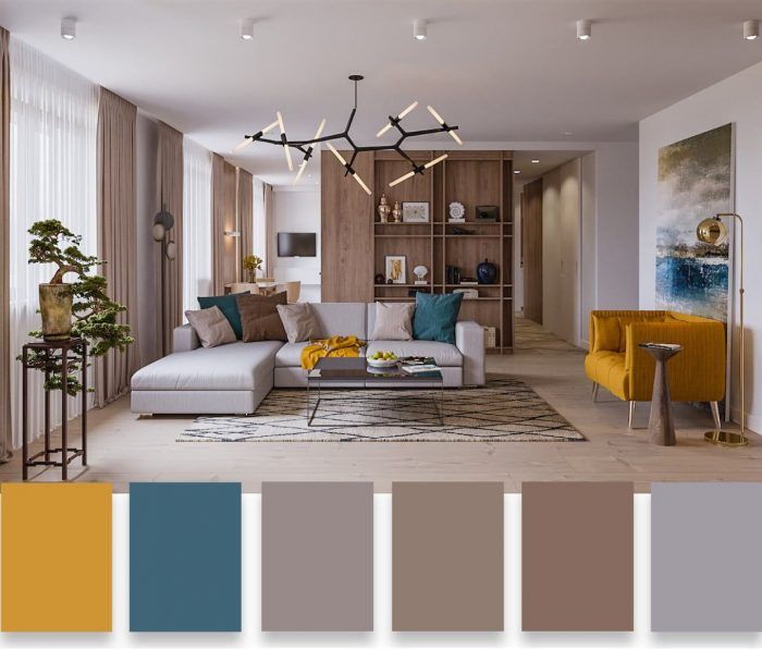
Accent Colors: Small Touches with Big Influence
A single accent can shift a room’s entire energy. A vibrant yellow lamp in a grey living room or a teal cushion on a beige sofa instantly adds dynamism. Accent colors allow experimentation without commitment. Seasonal accents, such as rich jewel tones in winter or pastels in spring, refresh interiors effortlessly.
The Role of Natural Light in Color Perception
Light is the silent partner of color. A shade may look vibrant in daylight but muted under artificial lighting. North-facing rooms often feel cooler, making warm colors ideal, while south-facing rooms receive abundant light, enhancing cooler tones. Before finalizing paint or fabric, testing samples under different lighting conditions ensures the chosen palette aligns with the intended mood.
Color Zoning: Assigning Purpose to Each Space
In open-plan homes, color zoning creates subtle boundaries without physical partitions. A calming blue in a work corner signals focus, while an adjacent yellow dining zone radiates energy and conviviality. Rugs, accent walls, or even furniture in different colors guide functionality, making spaces more organized and intentional.
Cultural and Personal Interpretations of Color
Colors carry varied meanings across cultures. In Western traditions, white symbolizes purity, while in some Eastern cultures, it signifies mourning. Similarly, red may represent love in one culture and prosperity in another. Personal experiences also shape how individuals respond to color. A person who associates green with childhood memories may find it comforting, while another may prefer to avoid it. Recognizing these nuances ensures interiors resonate personally and culturally.
Harmonizing Color with Materials and Textures
Color never exists in isolation—it interacts with texture and material. A glossy blue wall feels futuristic, while a matte blue evokes calm stability. Natural wood softens stark whites, while metallic finishes intensify jewel tones. Successful interiors carefully balance color with materials to create layered, multi-sensory experiences.
Conclusion: Designing for Mood and Productivity
Color is a silent yet powerful architect of human experience. At home, it determines how spaces feel, how people behave, and how productively they function. By weaving psychology with design, homeowners can craft interiors that inspire focus during the day and restore calm at night. A mindful approach to color transforms living spaces into sanctuaries of both productivity and peace.
